Build a Custom 404 Page and Never Miss Out on Potential Conversions Again
How to Boost your Potential Conversions through a Custom 404 Page
Are you aware of what happens when one of your website visitors lands on a webpage that doesn't exist(or else a 404 Page)?
Do you really care?
Well, you most definitely should care, considering an error page is a surefire way to send your users away from your website. Not only that, but you may just convince some people to never come back at all.
The point is, an error page is nothing to take lightly, and the coolest part is that you can generally design a beautiful error page in a few minutes and not have to worry about it again.
The primary type of error page is the 404. It comes in all shapes and sizes and you can modify yours to guide your customers to the proper places on your website. However, if left unattended, the 404 could serve little to no purpose at all.
What Exactly is a 404 Page?
This is the first question you should ask yourself. After all, there's no reason to implement something on your site unless you truly understand how it's benefiting your blog or company.
To start, you've most likely see a 404 error page before while you've browsed around the internet.
It's a page that alerts users when they have navigated to a URL that no longer exists. It's also common when you try to type in a URL but the page never existed in the first place.
That's it. As a website owner, you're simply telling your users that they have landed on a page that is nonexistent.
As an example, here's the LEGO 404 error page.
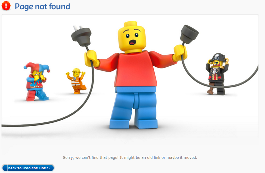
With most WordPress websites you'll get a very basic 404 error page. Some themes you purchase may spice it up a bit, but in general the 404 error pages tell people that they are at the wrong page, or that an error occurred. These aren't all that helpful, so it's essential to spend a little time designing a page that can replace that default 404 error.
Why is it so important to replace the default 404?
Because it displays the minimal amount of information to your users, not guiding them to the next step or explaining to them what they did wrong. Sure, more and more people are starting to understand what a 404 error page is all about, but it certainly doesn't mean they won't leave your site once they see one.
How Can You Use a 404 Error Page to Keep Site Visitors Instead of Turning Them Away?
In its most basic form, a 404 error page says that the user has landed on an error page, and that's about it. This format isn't all that helpful to the user, considering it doesn't bring them anywhere else or offer assistance to find another product or blog post.
Although 404 error pages seem useless, they can actually work wonders in terms of keeping site visitors instead of turning them away.
What should you include in your 404 error page to ensure that folks aren't immediately turned away from your website?
- A logo and identification - You'll find a surprising amount of 404 error pages that don't have any logo or brand identification. This is horrible for the user, because they suddenly have no idea where they are, and it's most logical to "X" out of the page. In theory, all the navigation, header and logo items should still be located at the top of the page.
- A funny or friendly acknowledgement that something wrong happened - You must show people that they didn't do anything wrong. A simple "whoops" is a good start to showing that your company is aware of the problem and that you can guide them elsewhere in the meantime. The best 404 error pages add some humor to the mix.
- A link to navigate back to the homepage - This is one of the most important parts of a 404 page, because most customers will simply want to get back to the homepage to start from scratch.
- A potential redirect to the most relevant page - Although a redirect is risky (since it may not bring them to the most relevant page,) it's better than a white page with no navigation whatsoever.
- A search bar - The search bar often eliminates the need for a link back to the homepage. This way users type in what they were actually looking for and move away from the error page.
Awesome Examples of 404 Pages (For Your Inspiration)
Now that we've covered exactly what a 404 error page is and how it can benefit your website, it's time to explore some of the best examples of 404 error pages online. You'll notice that most of them include at least the majority of the necessities we outlined above, with hints of comedy, some visuals, links to other places and the occasional search bar.
Bluegg

Bluegg has one of the more famous 404 error pages online, since it reveals that the page doesn't exist, but the navigational buttons are still at the top for the user to move around the website. A link to the homepage is offered, but the best part is the looping video of a screaming goat. The page asks whether you'd like to go to the homepage or sit and listen to the screaming goat. It provides a chuckle and hopefully convinces people to stick around for a while.
Github
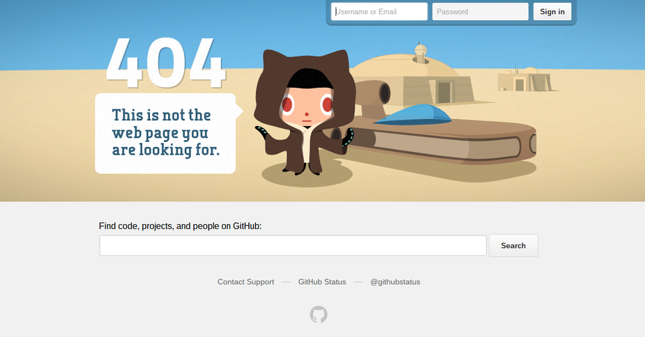
Github has a core demographic of software nerds, so why not cater to what nerds like? The Github 404 page takes from one of the famous Star Wars lines, and it also includes imagery to make you wish you were watching the movies right now. What's important, however, is that a search tab is provided, along with a few other links for users to get away from the error page.
MailChimp
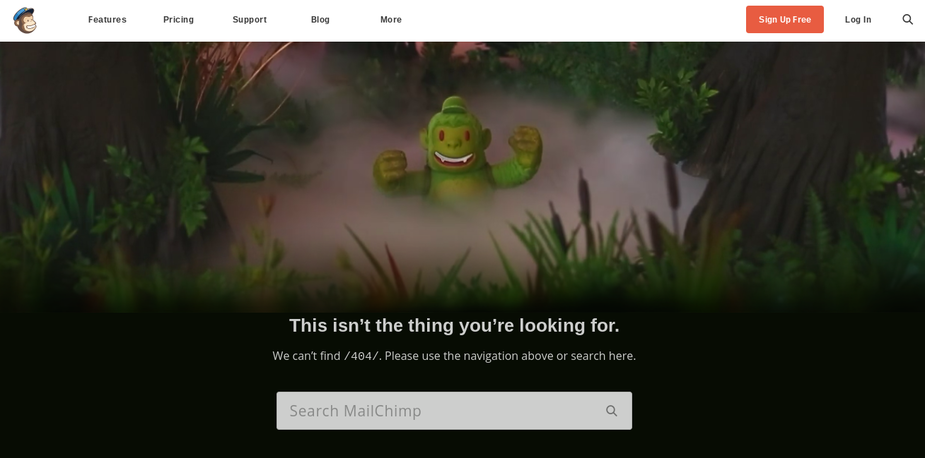
Known for its creativity, MailChimp has a visual 404 page that's simple and fun. It tells you that you're not in the right place, but it also offers a search module for moving away from the 404 page. You'll notice that if you keep the main navigation buttons at the top of the page, you generally don't have to worry about inserting links to your homepage or other more helpful pages.
Dropbox
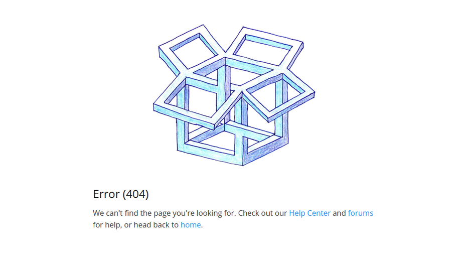
Dropbox is known for simplicity, so its 404 page is no different in that respect. When you land on the page you can clearly see that you're still on the Dropbox website. Right underneath the logo you can move to several links such as the Help Center, Forum or Home.
FixMyWP
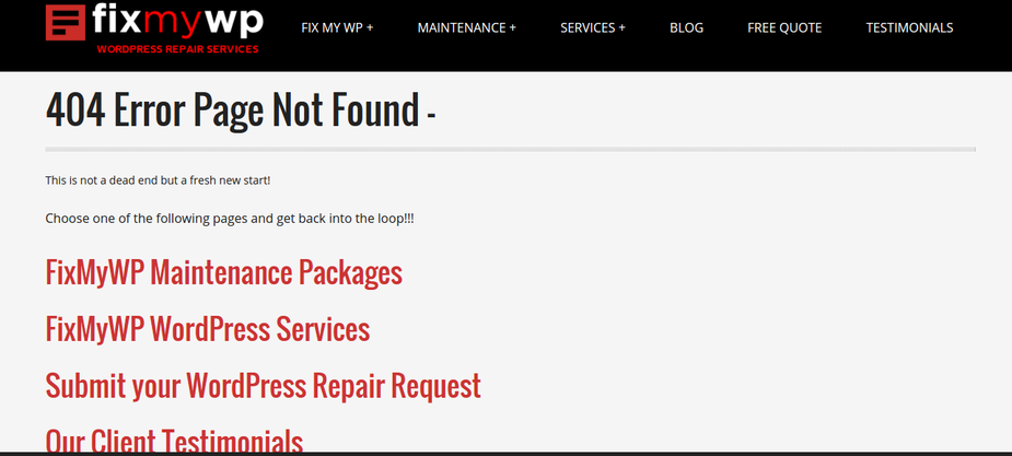
What does the FixMyWP 404 page look like? We already have the menu navigation at the top of the page, but we also try to make it as easy as possible for users to get out of the error page and into a more helpful area such as a client testimonials page or the WordPress Support Services information page.
Bad Examples of 404 Error Pages
Not all 404 error pages are good. In fact, one could argue that the majority of them are quite terrible. Here's a look into what you should avoid for your own 404 message.
The Prime Example
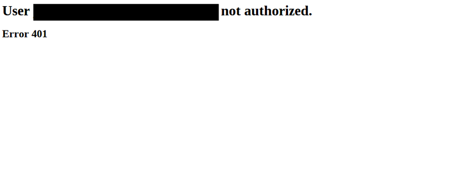
This is the prime example of what most website 404 pages used to look like. What's crazy is that so many websites are still designed like this, and the messages do nothing to help out customers. Not only is it intimidating and boring, but the user has no way to navigate away from the page. Sure they could hit the Back button, but they're much more likely to exit the window and move on with their lives.
YouTube

The YouTube error page is surprisingly bland, and it doesn't even have a link to the homepage. It does have a nice search bar towards the bottom, but you'd think YouTube would at least take a second to have some creative video playing when someone landed on a 404 page.
Blogger

It's funny that so many Google-owned website have terrible 404 pages. The Blogger platform is the worst of them all, providing two lines of text: Not Found and Error 404. You can't search for another term or move to a different page. Every user is forced to click the Back button or completely move away from the site altogether.
AT&T
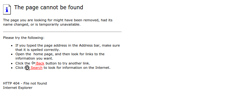
AT&T wins the boringness award, because this error page looks like it's from the 90s. Yes, they have links for going back and searching for another term, but it's ugly as heck and you should make sure your 404 error page doesn't look like this.
Digital Point
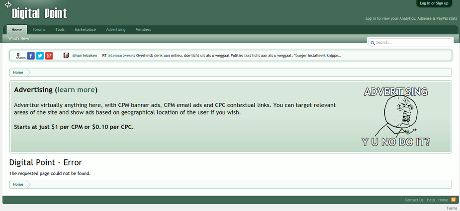
The Digital Point forum provides navigation at the top of the page, but instead of helping people figure out how to get away from the error page, they shove an advertisement down your throat. It's not a great way to make users happy.
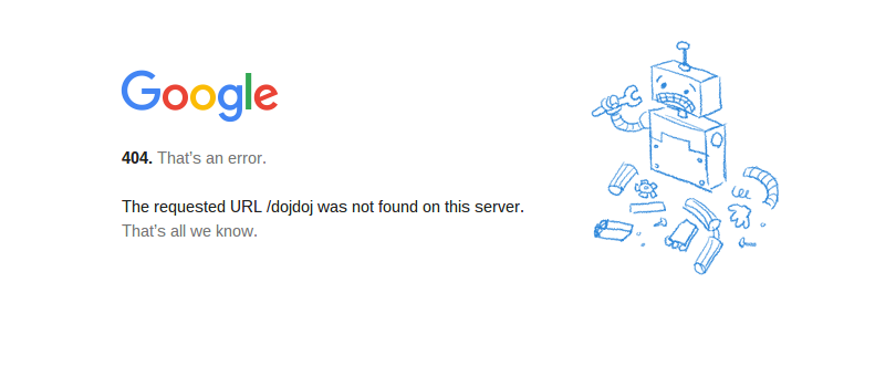
Finally, we have Google. Remember, this is the company that says your SEO can be affected if you don't have a quality 404 page. However , they have one of the worst out there. The branding is on-point, but it's unclear where the homepage link is (you have to click on the logo,) and no other humor or assistance is offered.
What are Some Plugins You Can Use to Build 404 Pages?
Building a 404 page use to be a pain in the butt. Most web designers went into the source code to modify what they wanted to show up. Now, all you need is a WordPress plugin. Keep reading to learn about the best solutions on the market.
Custom Error Pages

Here's a free option that allows you to make your own custom 404 page without touching a single line of code. The point is to prevent that bland error page and make it somewhat creative. The plugin works with any theme you have on your website, and it helps you make a header and text from the backend of your site. Once you create your error page, publish it and never touch it again.
404 to Start
Some folks don't like the 404 error page at all. In that case, the 404 to Start plugin will automatically redirect people to the homepage if they land on a nonexistent webpage. Keep in mind that this may cause a little confusion, but many users actually enjoy the fact that they don't have to look at a junky error message and figure out where to go from there.
404Page

The 404Page plugin is one of our favorites, since it works with all themes and it doesn't take long to build a beautiful 404 error page without any coding knowledge. What's cool about this plugin is that it doesn't create redirects and it doesn't require additional server requests. This means that it doesn't load down your server as much, which is often the case with other 404 plugins.
WordPress Ultimate 404 Plugin
The next two plugins are paid solutions, but they're certainly worth looking into considering they both have powerful tools for building creative 404 error pages. For example, this plugin is all about the visuals, so you can generate a responsive, image-based theme within a few minutes. A custom URL redirect is offered, and you gain access to a few prebuilt 404 themes so that you don't even have to put any thought into it.
WordPress Ultimate Redirect Plugin
The WordPress Ultimate Redirect Plugin is another favorite, since it provides a mobile redirect, and it has auto-redirects if you choose to go down that route. Import and export rules are a bonus, and the multiple devices and sources help with compatibility.
Over to You...
Now that you've had a chance to understand why it's important to build a custom 404 page in order to never miss out on possible conversions, take a look at your own website to see what your 404 page displays. In general, you can type your URL in the browser, punch in a "/" and punch in some random letters to bring up a page that doesn't exist at all.
Feel free to share links to your 404 error page in the comments below. If you have any questions or would like to get started building your 404 page, drop a line in the comment section below, or start with using one of the plugins we recommended above. Good luck!

